Hot Color Trends of 2011
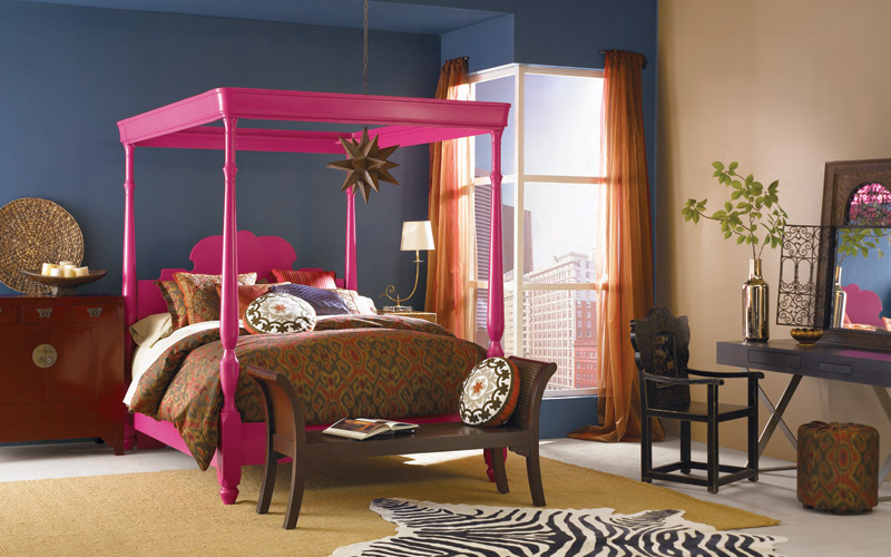 Pantone, the color authority of the world, announces each year in December the “Color of the Year” from a palette selected by a group of professionals in fashion and design. It is this authority that connects the color trend through global markets that is widely embraced by the fashion industry, which trickles down to the interiors and furnishings market. It is a much awaited moment for designers, since this color influences their design and the products they create for the market.
Apart from Pantone, paint companies like Benjamin Moore, Sherwin Williams and ICI Dulux decide paint color trends for each year.
Pantone‘s Color of the Year - 2011
This year, Pantone decided on a Hot Pink hue that gets its inspiration from the Honeysuckle flower, known to attract humming birds more for its bright color than its sweet smelling nectar. The color came as a surprise for most people in the design industry because it is stereotyped as a color for little girls. What is it about this color? I feel it is a very challenging color, but, what I also see is the versatile quality the color seems to reflect. Versatile, because the pink - red hue has tones of red that make it a bold color, while the pink tone embraces this boldness with much needed grace. While the color is easier to use in fashion design, it definitely poses a challenge for interior designers. Pink dining room anybody? I would pair the color either dominantly or subtly with creams, and undertones of gold, blue-greens with undertones of orange, or pair it with neutrals like gray and brown.
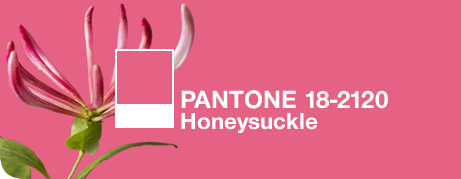
Honey Suckle – 182120 TCX – (Image Source: www.Pantone.com.)
What made Pantone decide on this color?
Leatrice Easeman, the executive director of Pantone, said, “In times of stress, we need something to lift our spirits. Honeysuckle is a captivating, stimulating color that gets the adrenaline going – perfect to ward off the blues.” In other words, it’s an antidote to the depressed economy and general state of the world.
(Source: Pantone via Sensational Color)
Pantone guarantees that this bright and fresh color produces a healthy glow when worn by both men and women. It’s a striking, eye-catching hue that works well for day and night in women’s apparel, accessories and cosmetics, and in men’s ties, shirts and sportswear. Add a lively flair to interior spaces with Honeysuckle patterned pillows, bedspreads, small appliances and tabletop accessories. Looking for an inexpensive way to perk up your home? Paint a wall in Honeysuckle for a dynamic burst of energy in the family room, kitchen or hallway.
What were the colors from previous years?
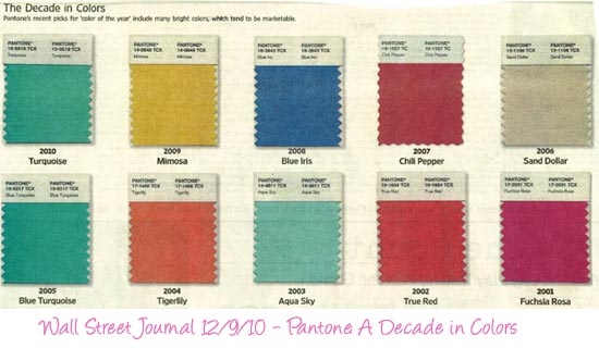
The color of 2010 was Turquoise, a much loved color that was used widely in the fashion and furnishings industry. Notice in the image above the color of each year either compliments or contrasts with the color from the previous year. So is the case with Honeysuckle, contrasting perfectly with Turquoise, yet blending to create harmony in design or décor. The colors from the previous years don’t really disappear but are absorbed with the current color in patterns, fabric prints and the like.
“Each color embraces the next color like yin and a yang…” -Kiki Tuttered, Trend Forecaster - Sensational Color.
In the ‘Color Trends 2011’ report, Kikki says “As designers and homeowners (and everywhere else in life) we are constantly looking for balance. After what many Americans have struggled through the past few years, it shouldn’t be surprising that even with the “color of the year” we are searching for and creating balance”.
In the same report, Kate Smith and Kiki Tuttered predict that there will not be a striking change in color or design direction of 2011 but a continuation and strengthening of several trends that have been around or emerging over the last year.
How Designers Will Use the Color of the Year
I was curious as to how Interior designers were going to use this color in their projects; I wrote to a few Atlanta based firms, and was excited to get a response back by Mollie Chalk, a Designer from Pineapple House Atlanta, who had a similar opinion on the relationship of colors from the past.
“The 2010 color from Pantone was Turquoise and soon enough, the 2011 Pantone color Honeysuckle will reign. Although I acknowledge that the intense flowery pink will trend in many areas of fashion and design, I think that the "honeysuckle" color theme will be more successful in residential interiors if used with restraint. I expect to find and utilize more of the trending color in accents such as pillow fabric, glassware, and decorative accessories. Although this flashy pink color is this year’s trend, I think that you will find it alongside this year’s Turquoise and other sherbet inspired colors”.
Interested to see how the trend unfolds I made a collection of non-fashion related elements on my Blog -GreenUrbanMotifs. From wall paper to credit cards, I think the color is catching up and hope it lift the spirit of the people, all together giving hope for a better and brighter year ahead.
Color Trends from Paint companies
Sherwin Williams, on the other hand, came up with four interesting trends that have color palettes reflecting Bright bold to subtle shades of color. The Colormix 2011 boasts a palette that has elegance of clean classic lines while embracing the free spirited nomad.
Benjamin Moore chose a deep luxurious yet comfortable shade called Vintage wine 2116 – 20. I think this is a bold twist to the neutral browns that we see so much these days. The color reflects warmth because of its earthy shade.
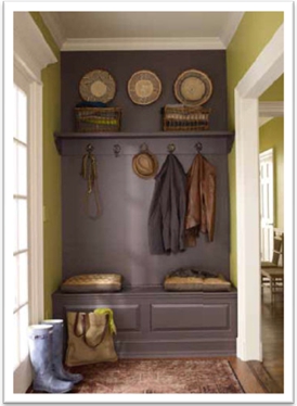
(Image Source: Benjamin Moore)
Designer Sonu, from the Blog – Living in Color with Sonu, says, “Vintage Wine has a layer of a rich brown which is culturally a color of comfort and familiarity. Think of things that give us a sense of relaxation like nature (soil/wood), chocolate, a warm cup of chai/coffee.”
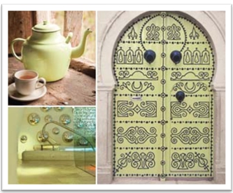
The ICI - Dulux color of the year for 2011 is a light and airy Citrus Yellow - H1 18.84 – The color symbolizes the freer spirit, fun and positive energy – (Courtesy – ICI Dulux)
The color may seem a bit too bright for people but will definitely brighten up any space in your home.
(Image Source: ICI DULUX)
Looking for a Pro? Call us (866) 441-6648

Painting Average Costs
Painters Experiences

Choosing A Professional House Painter, My Way

Exterior House Painting Completely Changed The Look Of My Home


