Alternatives to Decor Color Trends
 Color trends change every three to four years. The American market is saturated with the color trend of that moment in time as manufacturers produce it in textiles, paint, clothing, automobiles, china, napkins, and the list goes on. But what do you do if you do not like the current trends? Don’t use them! Select your own personal palate that suits your needs.
Color trends are often driven by the emotional climate of society, much like the stock market. Let’s look at the trends for the past decade and explore the reasons why the colors were selected. If the current trends do not suit your taste, alternative colors and the psychological effects are listed. Perhaps one of them will give your space the look and feel that you desire.
Color Trend: Brown
In our country after 9/11 the color trend was brown…brown walls, bedspreads, towels, rugs, and apparel. After 9/11 our nation could not feel happy, the neon green, bright pink and citrus orange of yesterday were far too happy, self confident, and bold for our countries emotional state, thus brown became the trend. The color brown is associated with sadness and wistfulness but on the other side of the equation is also deemed as solid and reliable, the color of the earth and nature. What color better suited our national sorrow after 9/11?
Alternative: Taupe
If your life is full of stress, the taupe neutrals are a great choice. The perfect taupe on the wall makes a statement to those who enter to disengage and be neutral. It's in the brown family, but it is lighter and more fresh-feeling than brown.
Color Trend: Gray
The next color trend was gray. Why do you suppose gray was chosen? The economy was on a rapid decline, homes were not selling, jobs were being lost and the word “recession” was in the news. Gray was the perfect choice. When asked, most people associate gray with a rainy day, hibernation, lack of confidence. While true that the proper gray color can have a pleasant and relaxing affect because it is a neutral color, gray reflected the economic status of the U.S. as homes were foreclosing and the “prosperity” of yesterday was lost.
Alternative: Blue or Blue-green
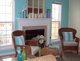
If peace and relaxation are the desired mood for the room then select a pastel in the blue/green tones. Martha Stewart has a color called “Milk Pail” that is very restful but not a prissy color. It has strength and depth and changes with the environment. Pale blue is also a nice choice as it evokes the feeling of sanctuary and trustworthiness. It is the color of the sky and water and therefore feels dependable. Blue is the most favored color worldwide.
Color Trend: White
This brings us up to date, the current trend is white with reclaimed and repurposed furniture pieces and the “less is more” approach to design. Again, the current color trend expresses our current economic status. Gone are the lavish interiors and large furniture and layers of accessories which signify wealth and a show of money. The non-color white signifies simplicity and efficiency with an open clean non cluttered look. However if you feel that white is hygienic and sterile, the color of a sanitarium and that you have better things to do with your time than to keep it clean….Here are some alternatives that might work for you.
Alternative: Neutrals
Last, but not to be overlooked, are the neutrals. The color beige or off-white is not as simple as it sounds. It can have a yellow cast, or pink, or gray, or brown. Therefore it is important to get a sample and try it in the room. Neutral walls are nice because they go with anything and are easy to decorate around.
Since color trends come and go, make finding your own color palate an exciting adventure by exploring the world of color until it feels right for you.
Looking for a Pro? Call us (866) 441-6648

Painting Average Costs
Painters Experiences

Cast Iron Bathtub Replacement Was Definitely Not A DIY Project

Beware Of Bad Contractors! Take My Advice To Protect Yourself


